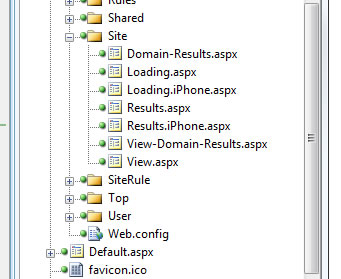
Whilst working on a recent project I noticed that I was getting some traffic from Apple iPhones and iPod Touches. The site used some pretty complex jQuery for user interaction - this didn’t translate into a workable user experience for mobile users.

Writing a Mobile Safari site is made easy with some of ASP.NET MVC’s Aspect Orientated Programming (AOP) features.
These allow you to address cross-cutting concerns with the use of filters. A filter can be attached to a controller
or controller action, and run before or after the action is executed.
###Processing iPhone Requests
To get a website to display a Mobile Safari version of the HTML for the iPhone, you can simply write a filter to switch between the standard HTML and the mobile version. Using the filter is as simple as decorating the controller with the MobileFilter attribute:
using System.Web.Mvc;
using Flipbit.Web.Filters;

namespace Flipbit.Web.Controllers
{
  [MobileFilter]
  public class HomeController : Controller
  {
    /// <summary>
    /// Shows the homepage.
    /// </summary>
    public ViewResult Index()
    {
      return View();
    }
  }
}
The MobileFilter executes after the action has executed, and simply decides whether to show the mobile version of the site or not.
/// <summary>
/// Called when the controller action is executed.
/// </summary>
public override void OnActionExecuted(ActionExecutedContext filterContext)
{
  // Only process when request is from mobile Safari
  if (!IsMobileSafari(filterContext.RequestContext.HttpContext)) return;

  // Only process Views
  if (filterContext.Result.GetType() != typeof (ViewResult)) return;

  // Get the name of the view
  var viewName = GetViewName(filterContext);

  var mobileViewName = viewName + ".iPhone";

  // Ensure that a mobile view has been defined
  if (!ViewExists(mobileViewName, filterContext)) return;

  // Assign the new mobile view
  var result = (ViewResult)filterContext.Result;
  result.ViewName = mobileViewName;
}
###Detecting a Request from an iPhone or iPod
The first thing the filter needs to do is determine if the user is accessing the site through an iPhone or iPod touch.
We can do this by examining the UserAgent string in the incoming HTTP request. If the device is an iPhone, the UserAgent
will look like this:
Mozilla/5.0 (iPhone; U; CPU like Mac OS X; en) AppleWebKit/420+ (KHTML, like Gecko) Version/3.0 Mobile/1C28 Safari/419.3
Meanwhile, the iPod touch looks like this:
Mozilla/5.0 (iPod; U; CPU like Mac OS X; en) AppleWebKit/420.1 (KHTML, like Gecko) Version/3.0 Mobile/3A100a Safari/419.3
In order to detect this, you can simply examine the UserAgent for an instance of the text “iPod” or “iPhone”. This should provide some protection for changes to the UserAgent over time due to upgrades etc…
/// <summary>
/// Determines whether this request was made from a mobile safari device
/// </summary>
/// <param name="context">The context.</param>
/// <returns>
/// <c>true</c> if request is from mobile safari; otherwise, <c>false</c>.
/// </returns>
public bool IsMobileSafari(HttpContextBase context)
{
  var isMobileSafari = false;

  if (context != null)
  {
    var userAgent = context.Request.UserAgent;

    if (!string.IsNullOrEmpty(userAgent))
    {
      var ipodIndex = userAgent.IndexOf("iPod");
      var iphoneIndex = userAgent.IndexOf("iPhone");

      if (iphoneIndex + ipodIndex > -1) isMobileSafari = true;
    }
  }

  return isMobileSafari;
}
###Dynamically Switching the View
If the request is from an iPhone or iPod touch, we need to use the HTML for Mobile Safari. This is stored along side the regular view, however has “.iPhone” appended to the view file name. This allows us to maintain two separate versions of the HTML and keep the same controller logic.
/// <summary>
/// Views the exists.
/// </summary>
/// <param name="viewName">Name of the view.</param>
/// <param name="filterContext">The filter context.</param>
private bool ViewExists(string viewName, ActionExecutedContext filterContext)
{
  // get the controller name
  var controller = filterContext.ActionDescriptor.ControllerDescriptor.ControllerName;

  // get the path to the view & map to IIS location
  var path = string.Format("~/Views/{0}/{1}.aspx", controller, viewName);
  path = filterContext.RequestContext.HttpContext.Server.MapPath(path);

  // see if the view exists
  return File.Exists(path);
}
The filter checks to see if the mobile view exists. If it does not, then the normal view is used by default, allowing the site to gracefully degrade if the mobile view is missing for some reason.

###Writing and Testing Mobile Safari HTML
With the filter in place it’s time to start writing some HTML for Mobile Safari. There are numerous sites to help get you started and test the result without having to do a full deploy and test using the iPhone.

Once you’ve finished, you should have a dynamically switching, mobile compatible version of your site.